Vols Online
.png)
Online Degree Programs at the University of Tennessee
— Problem
Improving Student Journey
Over time, the university website had been designed by multiple contractors and teams without a unified design framework. This resulted in inconsistent layouts, navigation, information architecture, and user journeys, making it difficult for prospective students to find relevant information and confidently move through the decision-making process.
The lack of a cohesive design system also led to inconsistent branding, buttons, typography, and components across pages, creating a fragmented experience. The challenge was to create a consistent, accessible, and user-centered experience that made it easier for prospective students to explore programs, find the information they needed, and take key actions, ultimately increasing inquiries, applications, and enrollment.
ROLE
RESPONSIBILITIES
GOAL
Senior UI/UX Designer
End-to-End UI/UX Process: Design Systems, Data Analysis, User Interviews, Accessibility, AI-Assisted Design, HTML/CSS, and Development Handoff.
Redesign the website to create an intuitive experience that improves the student journey and drives enrollment.
— Approach
Balancing User Needs with Business Needs
Before beginning the redesign, it was important to understand the project from both the user and business perspectives. As online degree programs were a relatively new initiative for the university, the website needed to support an emerging digital strategy while contributing to broader enrollment goals.
I began by working with the Marketing and Communications team to understand the website’s history, existing challenges, and context. I then interviewed key stakeholders to identify business needs, enrollment goals, project scope, available resources, and constraints. Finally, I spoke with a diverse group of users to understand their needs, behaviors, preferences, and pain points. These insights gave me a clear understanding of both user expectations and business priorities, creating an informed foundation for the redesign.
Affinity Mapping & Card Sorting with the Team
Teams across admissions, advising, marketing, and student support interact with students at different stages of their journey, giving each team a unique perspective on where the website was falling short. Through collaborative affinity mapping and card sorting, I brought these perspectives together to identify patterns, align priorities, and uncover recurring areas of friction.


Competitive Analysis
I conducted a university-wide student survey to better understand the competitive landscape. I also collaborated with the Marketing Insights team to identify key regional and national competitors and evaluated their websites, content strategies, program information, and overall user experience.
Stakeholder Interviews
Conducted interviews with key stakeholders to understand business priorities, enrollment goals, website challenges, functional requirements, and expectations for the redesigned experience.
Purpose
-
Define business and enrollment goals
-
Understand organizational priorities
-
Identify existing website challenges
-
Align the redesign with strategic goals
-
Understand project constraints and requirements
Participants
-
Director of Communications
-
Director of Marketing
-
Enrollment Coaching Manager
-
Director of User Experience
-
Data & Analytics Manager
-
Director of Enrollment
User Interviews
Observed users completing key website tasks and interviewed them about their expectations, preferences, and pain points to understand how they navigate and make decisions throughout the university experience.
Purpose
-
Identify user needs and pain points
-
Understand behaviors and decision-making
-
Uncover navigation and content challenges
-
Identify expectations and preferences
-
Discover opportunities to improve the user journey
Participants
Users from diverse backgrounds aged around 24 to 44
-
Alumni
-
Current Students
-
Prospective Students
-
First-Time Users
Understanding the Student Perspective
— User Interviews
I interviewed users to understand how they explore programs, what influences their decisions, and where they experience friction.
Before I enroll, I’d definitely want to know how long the program takes, how many courses I’ll need to complete. Like, am I committing to two years or longer? I’d want to know that before making a decision.
I usually look at what kind of jobs I can get with the degree. It would be really helpful if they showed what types of careers, industries, and positions graduates have gotten after finishing the program.
Since I’m looking at a doctoral program, I’d want to know more about the faculty and who I might be working with. I’d also want to see what kind of research they’re currently doing and whether it matches what I’m interested in.
I think money is probably one of the biggest barriers for people. I’d want to know how much the program is actually going to cost before I get too far into the process, including tuition, fees, and whether there’s any financial aid available.
Exploring Solutions Together
— team Brainstorming

.png)

— Prototypes
From Requirements to Reality
Identified and analyzed common themes, patterns, and trends from data collected through user interviews, stakeholder interviews, card sorting activities, competitive analysis, and data analysis reports. Based on these findings, the following prototypes were developed to improve the user experience while aligning with the university’s brand colors, visual styles, and established brand guidelines.
Program Page
-
The earlier design lacked key program information, so redesigned the page to surface essential details above the fold without requiring users to scroll.
-
Anchor links are visible above the fold, giving users quick access to key sections throughout the page.
-
Added essential program details to the hero section, helping users understand the program at a glance.
-
The Cost Calculator button is also available in the hero section, directing users to tuition information.
Cost Calculator
-
Proposed and designed the Cost Calculator after identifying the lack of tuition information as one of the biggest user needs.
-
The calculator allows users to customize factors such as transfer credits, residency, and other relevant details to receive a personalized cost estimate.
-
It provides a complete breakdown of tuition and associated expenses, including course fees, and other costs, giving users transparency into the total cost.


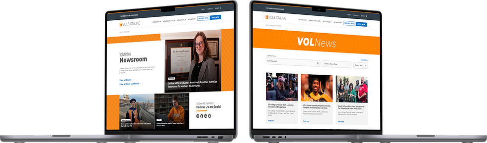
Newsroom
-
Proposed and designed a Newsroom to increase the visibility of both internal and external university news.
-
Created a centralized content hub where users can easily discover university stories, updates, announcements, and relevant resources.
-
Designed the experience to scale over time, allowing the Newsroom to expand with podcasts, student tips, videos, and other content that helps prospective and current students learn more about the university.
Chatbot
-
Proposed a new AI-powered chatbot feature in collaboration with the development team.
-
Designed the Smokey chatbot icon, incorporating the university mascot to create a recognizable and engaging experience.
-
Created an intuitive conversational experience that helps students quickly find information, navigate resources, and get answers through an AI assistant.


Search/Filter
-
The earlier design lacked search and filtering, requiring users to browse the entire program list.
-
Added filters for area of interest, degree type, format, and college to help users quickly find relevant programs.
-
Introduced grid and list views for flexible browsing.
-
Simplified program cards to highlight the program name and degree type for easier scanning and comparison.

A Better Experience, Measurable Impact
— RESULT
The redesign created a more consistent, intuitive, and accessible experience across the university website. By simplifying user journeys, improving content discoverability, and making key actions more visible, the new experience delivered measurable improvements across engagement, inquiries, program discovery, and enrollment.
+64%
deeper average scroll depth on redesigned program pages
+24%
increase in direct enrollments compared to the prior cycle
3.3×
higher RFI form conversion rate after redesigning and repositioning
+47%
increase in organic traffic following the layout cleanup
+31%
increase in application starts after simplifying program discovery
-29%
decrease in exit rate after improving information architecture
.png)